While the accuracy of findings in systematic reviews and meta-analysis is vital to decision-making, the presentation of findings in a comprehensible manner is also crucial. In the past, the findings were presented in text or tabular form. This was neither appealing to human eyes nor facilitated quick comprehension of the findings. Over time, data-visualization methods are being increasingly employed for this purpose.
What are the Different Types of Graphics and Plots used in Systematic Reviews and Meta-analysis?
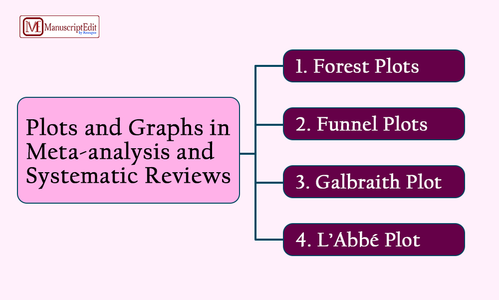
There is a wide array of plots and graphics frequently used in systematic reviews and meta-analysis. The most common ones have been listed below:
- Forest Plots: Forest plots are very commonly used graphical displays in meta-analysis. They are used to summarize the findings of a systematic review. The Forest Plot basically aims at highlighting the heterogeneity of findings of the individual studies included in the review. These plots denote point estimates and confidence intervals.
- Funnel Plots: Funnel Plots in a meta-analysis denote the presence of biases. A Funnel Plot is a scatter plot, in an asymmetrical shape, which represents that the studies included in the review contain standard errors. If there would have been no standard errors, the plot would lie on a horizontal line. The errors or biases here mostly denote the publication bias or the bias relating to the choice of inaccurate methodology for the review.
- Galbraith Plot: The Galbraith Plot, suggested by Rex Galbraith, also called as a radial plot is yet another way to graphically present meta-analysis findings. The Galbraith Plot provides significant information about the effect sizes and precisions relating to a specific study. The objective of these plots is to let the users estimate heterogeneity among the effect sizes. The Galbraith Plot is drawn showing z-statistic on the vertical axis and a measure of weight on the horizontal axis. The homogeneity of studies involved in the review is assessed by if they fall within limits.
- L’Abbé Plot: The L’Abbé Plot is yet another graph that represents heterogeneity in a meta-analysis. This plot takes the shape of a scatterplot comparing two binary groups. In comparison to other graphs, L’Abbé Plot has the advantage that apart from the heterogeneity, it also denotes the causes of such heterogeneity. Also, the L’Abbé Plot has the distinction of displaying the data on every individual study included in the review for each of the two binary groups. This lets the users not only identify the outlying studies but also the outlying groups within every individual study.
Conclusion
Using plots and graphs in systematic reviews and meta-analysis enhances the overall presentation of the findings of a review. It facilitates quick interpretations of the findings hence support the decision-making process for the stakeholders.


